Medication Error Visualization (MEV)
Stakeholder - U.S. Food and Drug Administration (FDA) . 2018 - 2019Project Goal
To design a visual analytics tool that uses interactive visualizations to support the analysis of medication error reports to help FDA in screening critical medication errors.
Project Scope
Team
My Role
About Medication Errors
Medication errors are preventable mistakes caused by wrong administration or handling of drugs due to ambiguity of the drug label or
carton.
Every year, serious preventable medication errors occur in 3.8 million inpatient admissions and 3.3 million outpatient visits with an estimated annual cost
of $20 billion.
Problem
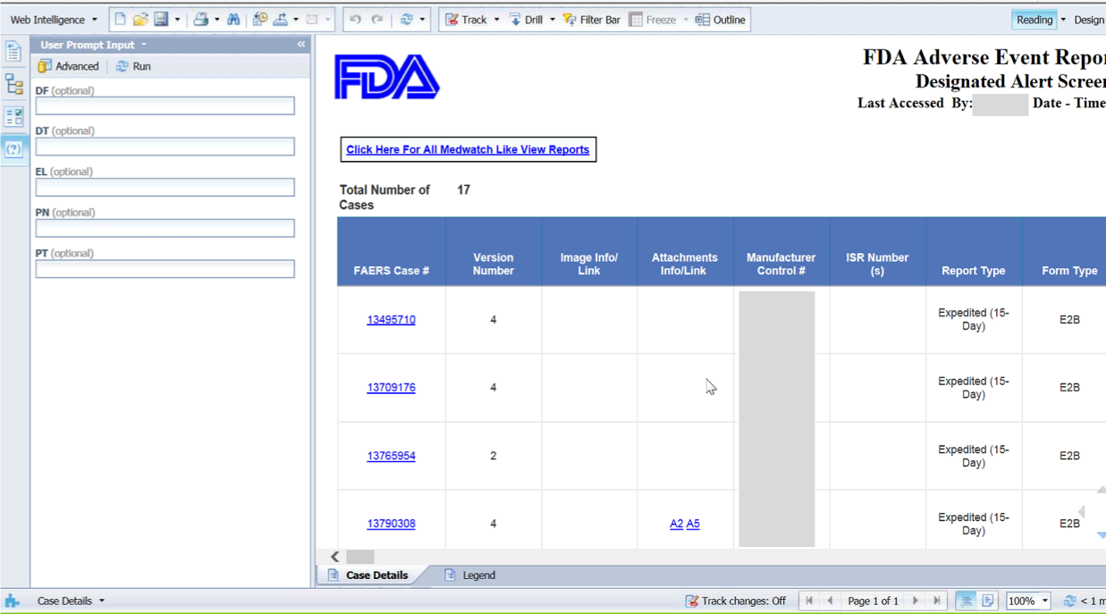
Currently, FDA uses spreadsheets or traditional table
layout to analyze medication error reports which can be inefficient and error-prone.
The goal of this project is to design a visual analytics tool that
helps drug safety evaluators in screening and prioritizing critical medication errors.
User Research
Our users for MEV are drug safety evaluators at the Division of Medication Error Prevention and Analysis (DMEPA) at the FDA who are responsible for the detection and prevention of medication errors.
Methodology
I observed five users at the FDA and conducted semi-structured interviews to understand how they analyze medication error reports. These interviews were guided by the following questions.
- How many drugs a safety evaluator gets assigned to?
- How many reports are received on a weekly basis?
- What is the most challenging aspect involved in the review of these reports?
- What steps they take to screen medication errors?
- What data elements are crucial for screening medication errors?
User Feedback to Elicit Requirements
"There is no way to see the most frequent medication errors from a list of reported errors."
"Most of the times we want to see all the reported MEDRA PT (medication errors) for a specific product and a time period, which is difficult to achieve currently."
"I struggle to see which products are involved in the error and what are the associated outcomes."
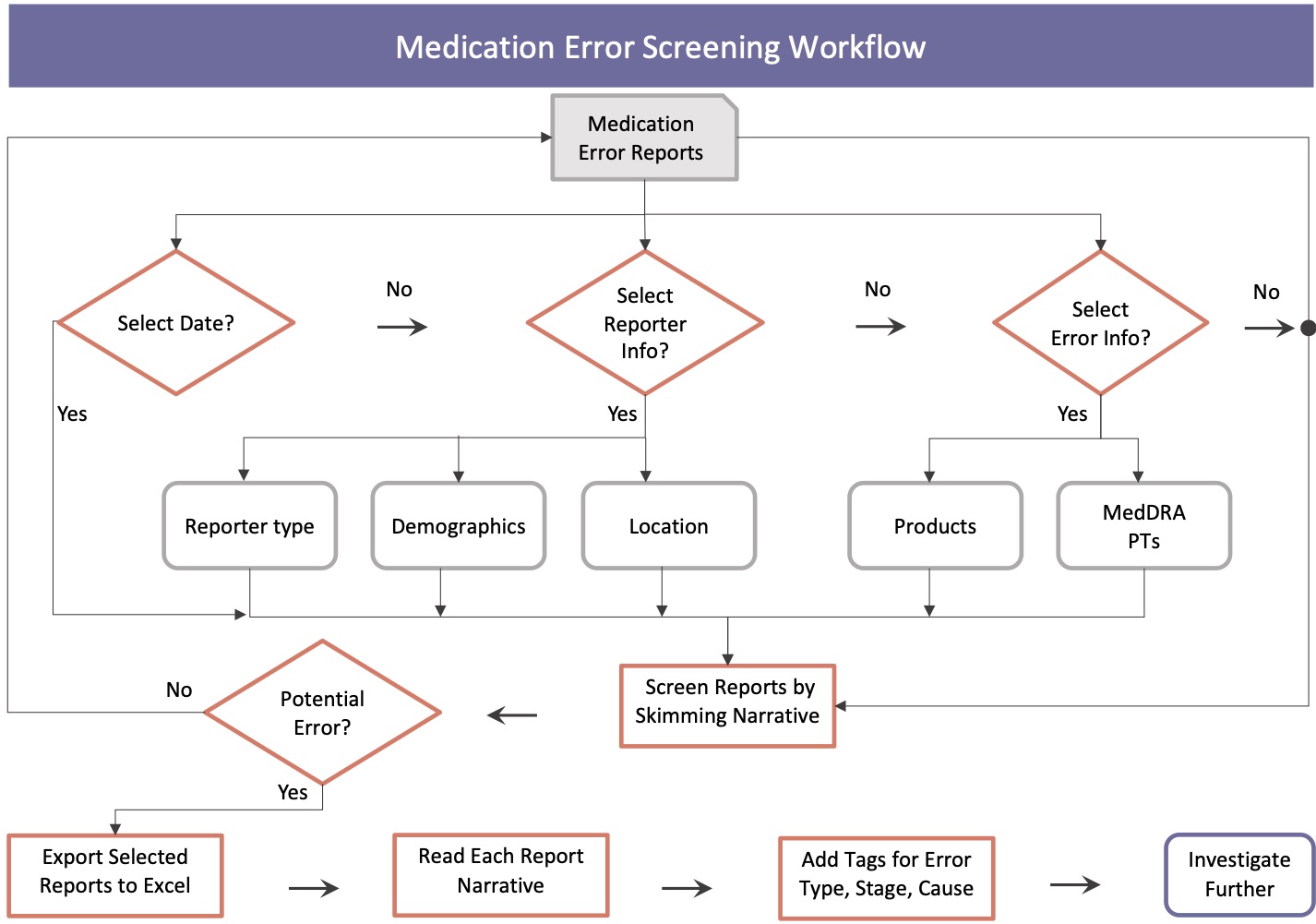
User Workflow to Screen Medication Errors
Design Requirements
Based on the user research, the following features were identified as high priority for the visual analytics tool to help in screening critical medication errors.
- Provide an overview of the core data elements for data screening.
- Support the exploration of reports over time.
- Facilitate the analysis of demographics.
- Allow the analysts to quickly see the related atttributes of a selected data point.
- Facilitate identification of critical reports.
- Provide access to the actual reports associated with the selection.
Design Process and Ideation
Data. The medication error reports contain structured information about patients such as age and gender, and medication errors such as types of errors, stages where
error has occurred, the names of the medications, and the causes of the errors with the later being high-cardinality attributes.
Literature Review.
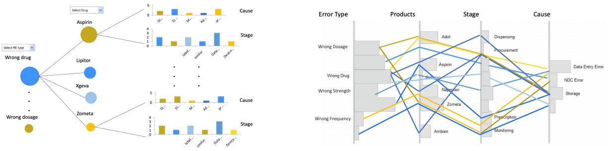
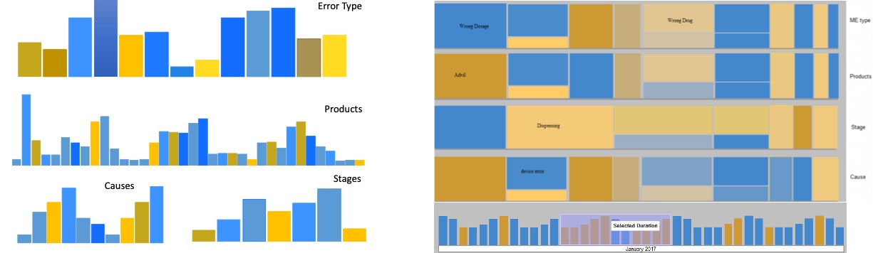
To design an interactive overview of the reports set, we considered multiple visual designs based on literature review.
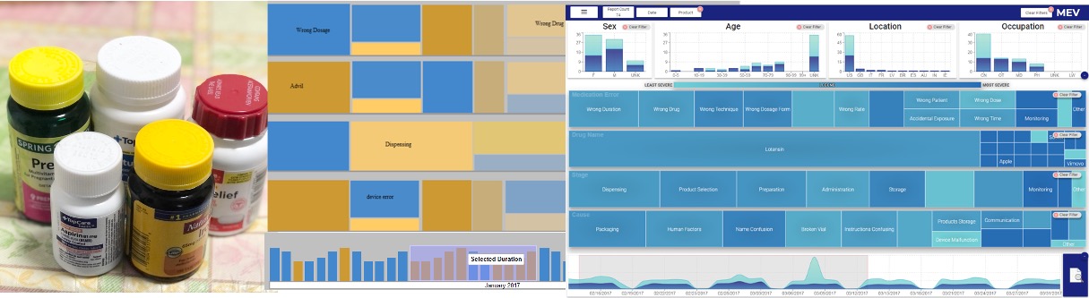
The candidate visualizations to represent these categorical attributes included a node-link diagrams, parallel coordinates, multi-layer bar-charts and treemap visualization.
Encodings.
The outcome of the reports (severity) for each attribute value is mapped to the color, and the count of the reports is mapped to the size of each element.
Visual Design and Sketches
Based on analyzing the pros and cons of each design, and discussions with users, the treemap visualization (bottom-right) is selected as the final design. However, with real data the color hue created different shades, therefore, color saturation is used in the final design.
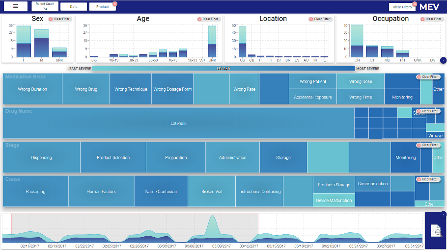
MEV Interface - Final Design
The top panel on MEV interface displays the structured information such as demographics of the patients. The middle panel represents a treemap visualization for each of the high-cardinality categorical attributes. The bottom panel represents the temporal summary of the reports, that is, reports count per day.
Uability Study for MEV Validation
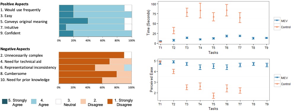
I designed and moderated a within subject task-based usability study with ten users at the FDA. Each user performed the tasks related to information search and extraction using MEV and their current tools (spreadsheets). Users also completed a system usability questionnaire at the end.
Findings - MEV is Easy and Efficient in Screening Medication Errors
Results of the usability study show that participants took less time to complete the tasks with MEV as compared to their current tools (control). Users also considered these tasks to be easier when performed with MEV.
Results - Users Liked It
"Well, I think this tool makes it very easy to see what the reports are describing without going into much detail."
"... It gives us a big sense of what kind of errors are being reported."
"It takes sometime to get used to the tool, then it is very easy and intuitive to use."
Takeaways
- MEV makes the error screening tasks 5 times efficient than spreadsheets.
- Error screening with spreadsheets is twice as difficult as with MEV.
- Task-based visual analytics improve error detection and user experience.
Next Steps
- Integrating external data sources such as PubMed and DailyMed to investigate an error.
- Adding support for analyzing the relevant reports after screening a medication error.
- Allowing users to share their findings and analyses with their team members.
I learned to ask as many probing questions during contextual inquiries as possible. I also learned to advocate for users and their needs when working with developers.
Read More
For more details on this problem and the usability study, please read this publication.