
Design Challenge - Probe
While annotations such as adding notes, bookmarks, and highlights are useful in reading books and many ebook apps provide these features. However, many audiobook apps don't provide these features.
The goal of this challenge is to design a highly interactive and personal audiobook mobile app that allows annotations.
Competitor Analysis
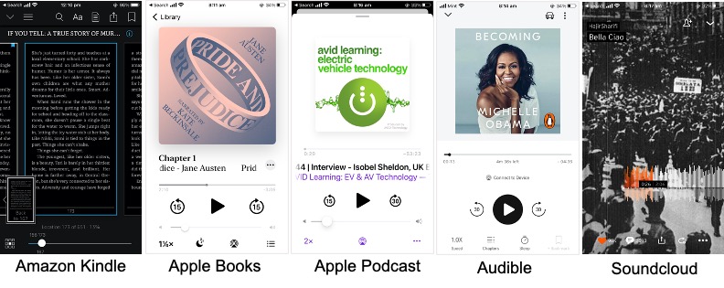
To have a better understanding of the required features, I explored a few apps.
- Ebook Apps - Amazon Kindle, Apple Books.
- Audtioplayer Apps - Audible, Apple's Podcast, Apple Books, Pandora, and Soundcloud.
Research and Design Inspiration
Libby is one of the few audiobook player apps that support adding annotations to a book. I experienced Libby as a user and identified the following design opportunities for redesign.

Key Pluses of Libby
- Track breakdown by time segment.
- Visual feedback of annotations.
- Activity history with a summary of annotations.
- Color options for highlight.
Design Opportunities
- Bookmark does not allow adding remarks.
- Unable to rename a bookmark.
- Highlighting is not intuitive (difficult to find how to highlight).
- Highlight is activated only when track is playing.
- Highlight is added at a point current time and does not support excerpt selection.
User Flow for Adding Annotations Based on Research

Identified Features for a Good User Experience
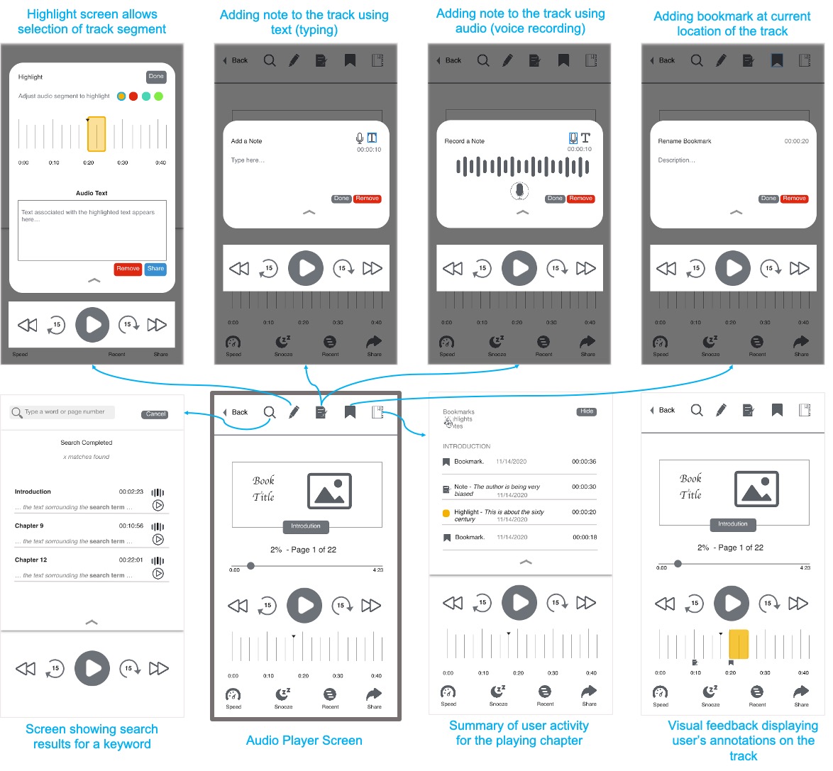
- Add bookmarks, highlights, and notes.
- View text related to the highlight.
- Add Notes (both using text and by recording audio notes).
- View and Edit the Annotation (Activity) History.
- Search in the audiobook for a word.
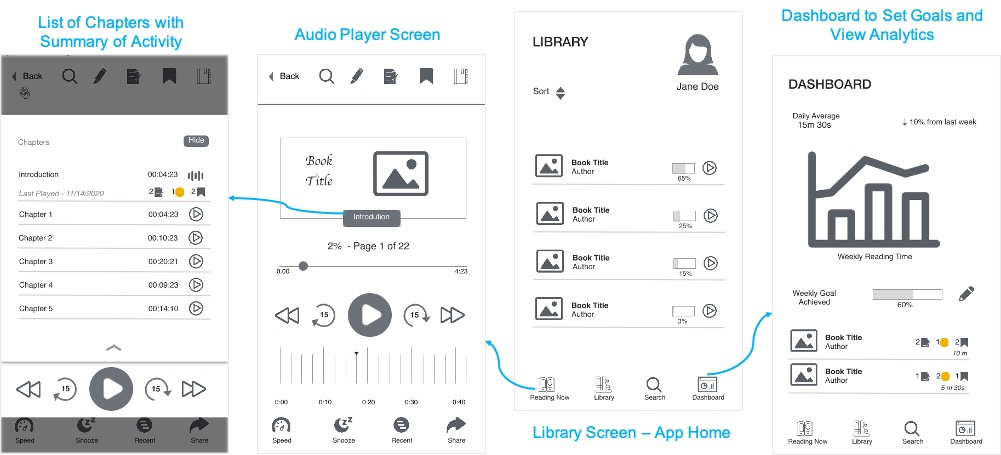
- Add a dashboard to let user set goals and monitor their reading routine.
- View summary of annotation activity for each book (currently reading).
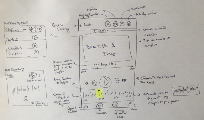
Paper Sketch to Add Notes and Highlights
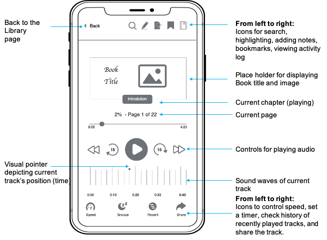
 Audioplayer Screen
Audioplayer screen - the focus of the design. Blue color elements are added for demonstration purposes and are not part of the design.
Wireframe for Search and Annotation Features
Library and Dashboard Screens
Takeaways
This design challenge gave me the opportunity to help users:
- Have a more seamless reading experience.
- Get more inclined to use audiobooks for their academic readings.
- Track their reading activity and monitor their goals.
Next Steps
- Adding dictionary access in the app.
- Audio to text conversion for audio notes.
- Zoom in/out on the track player (to control track breakdown).
- Attention check points set by the user to help them stay focused while listening to a chapter.
- Combine both audiobook and eBook experience together and let user choose.